The Power of Color in Event Design
Imagine walking into an event space that immediately uplifts your mood—the walls radiate warmth, the furniture is accented with vibrant hues, and every element feels harmoniously balanced. Color psychology isn’t just about aesthetics; it’s a strategic tool that can transform event experiences and influence attendees’ feelings and interactions. In this blog, we’ll explore how color psychology impacts event design and how you can harness its power to create memorable and engaging events.
What is Color Psychology?
Color psychology studies how different colors affect human emotions and behavior. Various colors can evoke different feelings and reactions. For example, blue often induces a sense of calm and trust, while red can create excitement and urgency. By understanding these nuances, event planners and venue owners can curate spaces that evoke specific emotional responses, making events more immersive and impactful.
The Science Behind Color and Mood
The human brain processes colors in the hippocampus, the region linked to emotions and memories. This connection allows colors to trigger deep-seated reactions almost instantly. Studies have shown that specific colors can increase heart rates, influence decision-making, and even alter perceptions of temperature. By leveraging these scientific principles, you can create environments that look great and feel perfectly aligned with the emotional tone of your event.
Choosing the Right Colors for Your Event
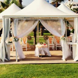
Selecting the right color palette is crucial for setting the tone and mood of your event. Your chosen colors should align with the event’s purpose, theme, and audience. For instance, a corporate seminar may benefit from calming blues and greens to promote focus and productivity. At the same time, a lively festival could incorporate bright yellows and oranges to foster energy and excitement. Always consider the psychological impact of each color and how it complements the overall ambiance you’re aiming to create.
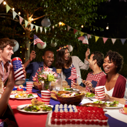
Red for Excitement and Energy
Red is a powerful color known for evoking strong emotions. It’s often associated with excitement, passion, and energy. Incorporating red into your event design can stimulate attendees, creating a sense of urgency and enthusiasm. However, be cautious—too much red can be overwhelming and may even provoke anxiety. It’s best used in moderation or as an accent color to create a dynamic yet balanced atmosphere.
Blue for Calm and Trust
Blue is often associated with tranquility and trust, making it a popular choice for corporate events, conferences, and seminars where focus and communication are essential. Different shades of blue can have varying effects; light blue is calming and relaxing, while dark blue conveys authority and professionalism. Integrating blue into your event can foster a sense of calm and reliability among attendees.
Green for Balance and Refreshment
Green symbolizes nature and renewal, making it an excellent choice for events that rejuvenate and refresh guests. Known for its calming effects and ability to reduce stress, green can inspire feelings of growth and new beginnings—ideal for workshops or creative brainstorming sessions. You can incorporate green through plants, decor, or lighting to infuse your event with balance and harmony.
Yellow for Optimism and Happiness
Yellow is the color of sunshine and often evokes feelings of happiness, optimism, and creativity. It can brighten up spaces and uplift attendees’ moods. However, too much yellow can be jarring, so it’s best used in moderation. Pair it with softer tones to maintain a cheerful yet comfortable environment. Yellow works well in networking events, social gatherings, and creative workshops where positivity is key.
Purple for Luxury and Creativity
Purple is often associated with luxury and creativity, making it an excellent choice for high-end events or artistic showcases. It can stimulate imagination and innovation. Deeper shades of purple evoke a sense of luxury, while lighter purples add a more playful, whimsical touch. When used thoughtfully, purple can elevate the sophistication and creativity of your event.
Orange for Enthusiasm and Warmth
Orange combines the energy of red with the happiness of yellow. It’s a warm, inviting color that can stimulate enthusiasm and social interaction, making it perfect for casual, laid-back events where you want to encourage mingling and engagement. Be cautious of its intensity, as too much orange can be overstimulating. Use it strategically to highlight critical areas and create a welcoming atmosphere.
Using Color to Guide Attendees
Colors can also be used as practical tools to guide attendees throughout your event. Using contrasting colors to highlight important areas—such as registration desks, information booths, and exits—makes navigation easier. Color coding different sections of your event space can help guests find their way without confusion, enhancing the overall flow and ensuring a seamless attendee experience.
The Role of Lighting in Color Perception
Lighting is critical to how colors are perceived. Natural light enhances colors, making them appear more vibrant, while artificial lighting can alter the hue of your chosen palette. Consider the lighting conditions in your venue and how they interact with your color scheme. Experiment with different lighting options to ensure your colors appear as intended and enhance the mood you’re trying to create.
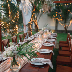
Creating a Cohesive Color Scheme
A cohesive color scheme ties all the elements of your event together, creating a harmonious flow that enhances aesthetics and functionality. Select a primary color that reflects your event’s theme and purpose. Then, choose complementary colors to accent and highlight specific areas. Consistency is key—ensure your color choices extend across all event elements, from invitations and decor to signage and promotional materials.
Incorporating Brand Colors
Incorporating the company’s colors can reinforce brand identity and create a cohesive experience for branded events. Use the brand’s color palette as a foundation for your event design, ensuring the colors reflect the company’s personality and values. This approach strengthens brand recognition while enhancing the event’s overall ambiance.
Measuring the Impact of Color on Attendees
To refine your future event strategies, measuring the impact of your color choices is helpful. Collect feedback from attendees through surveys and observe their behavior during the event. Look for correlations between your color scheme and attendee satisfaction or engagement. These insights can guide your decisions and help you fine-tune your design approach for future events.
Conclusion
The influence of color psychology on event design is powerful. By understanding how different colors affect mood and behavior, you can create environments that resonate with your audience and elevate their overall experience. The key is balancing aesthetics with functionality—carefully chosen colors can turn an ordinary event into an extraordinary one, leaving a lasting impression on your attendees. Ready to elevate your next event using color psychology? Start experimenting with different palettes and see how they can transform the attendee experience, whether a corporate seminar, a creative workshop, or a glamorous gala.